

Creating a Movie Poster in 5 steps
 |
| 1st SAF TPT BN's Media Team (Credits to Jonathan Danker, Y Collective & 8 Pixels) |
I can't resist but to put up this poster I'd done for the media team in my army battalion(of which, I am a part of). How did this come about you ask? Well, I just did a video of the recent National Day Parade, for which my battalion was a part of. And when my sergeant major told me he wanted us to design up the appreciation posters and certificates to be given for those involved in the event, we couldn't help but grin like little mischievous kids.
Not only would we do certificates for volunteers, we would make a certificate for ourselves also(in recognition of the video). Plus, sergeant major added that we had free reign on the background photo of our certs!
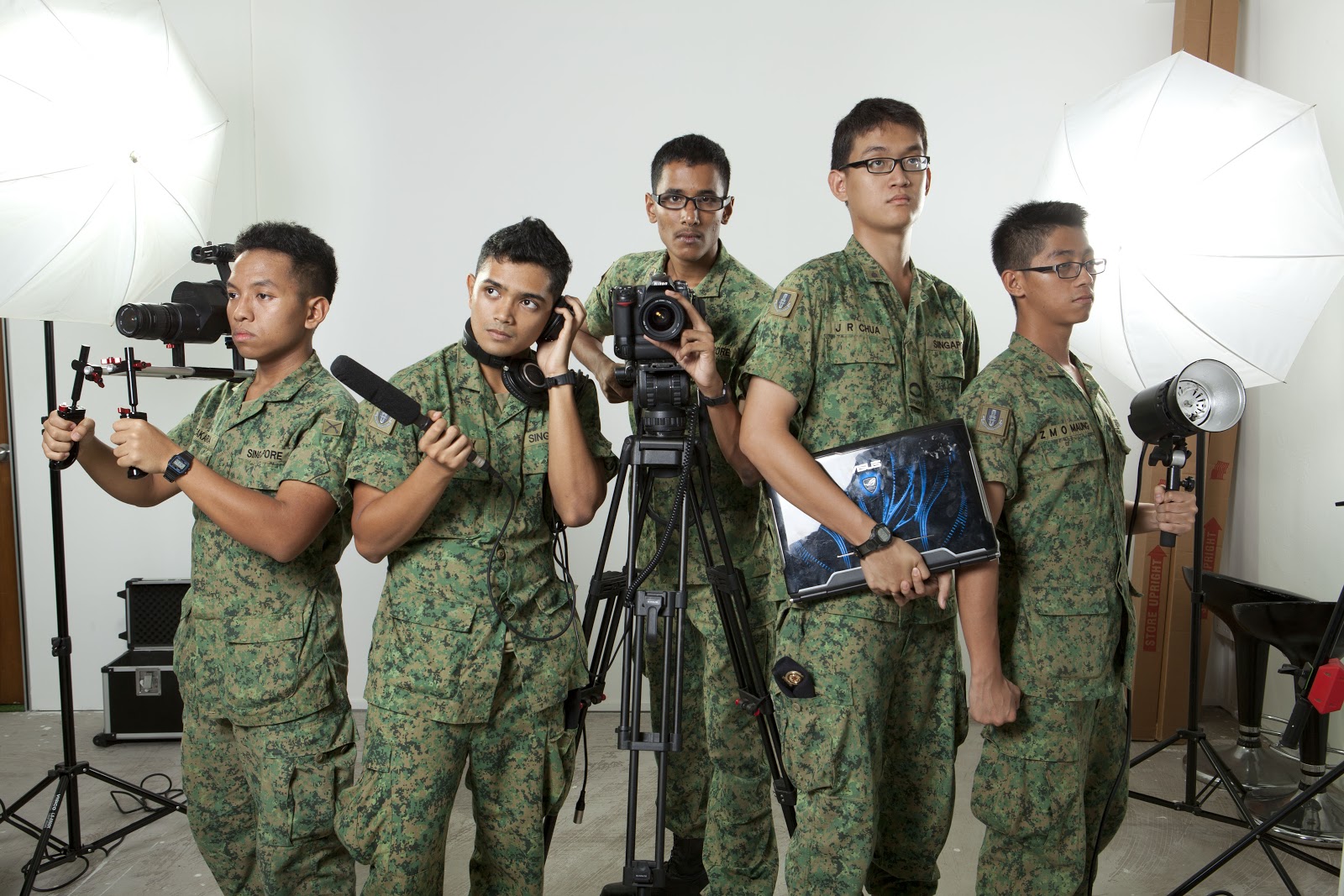 |
| And so we used this photo for the certificate. Taken in the studio. (Credits to Jonathan Danker, Y Collective & 8 Pixels) |
 |
| Here's the finished version of: NDP Certificate of Appreciation (Credits to Project Team, 1st SAF TPT BN/TPT HUB NORTH) |
Thank you Johnathan Danker!(by the way, I'd like to congratulate him on his first workshop not too long ago)
And so we started on our studio shoot, working hand in hand with the expert photographer. Here are the photos:
 |
| That's me right there: Thanks Jon Chia for his camera (Credits to Jonathan Danker, Y Collective & 8 Pixels) |
 | |
|
 |
| Zakaria Rosdan; Awesome Shooter & Motion Graphics personnel (Credits to Jonathan Danker, Y Collective & 8 Pixels) |
 |
| Melvin Chua; The backbone of our IT solutions. Whiz kid.(Credits to Jonathan Danker, Y Collective & 8 Pixels) |
 |
| Abilash Subaraman; Flexible as a rubber band. Adept at all things. (Credits to Jonathan Danker, Y Collective & 8 Pixels) |
Looks good no? great lighting, good equipments on display, simple yet shows what we are. A few days later, we got our photos from Jon, the photographer! Christmas came super early...;P
So we did up a few individual shots, for which we planned to insert side-by-side into our certificate. Rationale; for it to look like a collective of talented individuals. Like these examples here:
 |
| This was what we thought of initially... ('Closer' the Movie by Mike Nichols) |
 |
| ...eventually, I figured that this concept 'seperated' everyone instead of making us look like a cohesive group. ('Horrible bosses' the Movie by Seth Gordon) |
Back to the drawing board I guess. Since the group shots were used in the certificates, we decided to not recycle them in our poster. So, in short, we had to find a way to incorporate all the individual shots into one poster and to make it look cohesive. It struck me to have our poster in landscape and to have everyone stand side-by-side with their equipments....
...But I was beaten to the idea.haha.The Y Collective did a photo of us to be included into the portfolio. Now that concept is out of the way, I need to figure out a different concept for the poster. (By the way, check out Y Collective's poster of us directly below:
Then it struck me.
What if I could have the team arranged on top of each other diagonally across the poster?(poster in portrait setting)
Genius.not quite.but close.
Alright, I hope I didn't bore any impatient readers out there!^^ One last thing before I proceed with the photo surgery would be to have a great backdrop. I just went to google and grabbed some random free 'texture' photo. Keep in mind that the textured photo that you use be simple and you have to use your judgment to determine whether it will clash with your main pictures. Everything else would be done using PS's own arsenal of tools. Let me recap again; Here's what I needed to start on my poster editing.
Once all is covered, open photoshop, create new canvas. Dimension; 27" by 41". Standard One sheet poster. Keep in mind, dimensions of the poster can be altered to your liking, you don't have to follow this part.
Alright comrades...
This requires abit of thinking. Text is the secondmost important in a movie poster after the main pictures. This, I feel strongly about. So I spend much of my time figuring how to position my text to blend into my poster. Choice of fonts also matter a lot; In this case, I've used Univers Ultra Thin Condensed.
So. I've done up the text and background. Next up. Special effects. Here's where you get the pow! and the bam! in your poster. Smoke and fire and brimstone! Muahahah! well. let's get on with it...
STEP 4: Placing The Main Subjects In The Composition
Ahhh~ this is the main gist of my photo! This is what breathes life into me. but before I hastily insert my subjects into the main comp, I'd have to clean up the image abit. Well you know, sharpen abit here, perhaps do a little clean up of the face. I wouldn't want the subjects to appear with acne now do I? ;DD
There you go! That's all there is to it. Now, to frame this piece up in the media room...where shall I put it?
© 2013 Fadly.M.H.Wychowvski
 |
| Thank you Y collective! (Credits to Jonathan Danker, Y Collective & 8 Pixels) |
Then it struck me.
What if I could have the team arranged on top of each other diagonally across the poster?(poster in portrait setting)
Genius.not quite.but close.
Alright, I hope I didn't bore any impatient readers out there!^^ One last thing before I proceed with the photo surgery would be to have a great backdrop. I just went to google and grabbed some random free 'texture' photo. Keep in mind that the textured photo that you use be simple and you have to use your judgment to determine whether it will clash with your main pictures. Everything else would be done using PS's own arsenal of tools. Let me recap again; Here's what I needed to start on my poster editing.
1) All my individual shots as listed above
2) A textured background to my liking
3) If you're particular about the standard movie poster font, you'd have to go purchase it. Font name is; Univers Light Ultra Condensed
Once all is covered, open photoshop, create new canvas. Dimension; 27" by 41". Standard One sheet poster. Keep in mind, dimensions of the poster can be altered to your liking, you don't have to follow this part.
Alright comrades...
STEP 1: Creating The Perfect Backdrop For Your Poster
Once you've got the dimensions that you need, let's start on creating the backdrop or background for the poster. A habit of mine when creating posters or any photo for that matter is to first create a gradient. It helps me narrow down the photo's focus point to one single subject.
 |
| At the bottom of the layers window, hit 'create adjustment layer'> gradient. |
 |
| I always set my gradient to radial and max out the scale percentage. Lastly, I'd check the 'reverse' box. There's also an option for you to play around with the darkness,reach of the gradient etc. So play around! |
 |
| Once you're done with the gradient, import the texture into the comp as shown above. Place the texture file at the bottom of the gradient. |
 |
| Neatly group the textured file as well as the gradient layers. In this case, I named mine 'Background comp'. I do this so i can pinpoint my layers easier. |
 |
| Once you're done with the backdrop, it should look something like this. Gorgeous isn't it? |
STEP 2: Texts On Your Poster
This requires abit of thinking. Text is the secondmost important in a movie poster after the main pictures. This, I feel strongly about. So I spend much of my time figuring how to position my text to blend into my poster. Choice of fonts also matter a lot; In this case, I've used Univers Ultra Thin Condensed.
 |
| In here, I've typed out the Heading of the poster; "Project Team". Along with the names of people involved and lastly, a tagline; "...Sometimes, we are your only hope" |
 |
| Again, I neatly organize my layers palette by creating a group folder called 'Text' and dump all the text inside. Remember that the text folder should be on top of the 'Background comp'. |
 |
| Here's what my composition looks like so far. STEP 3: Special Effects on the poster |
So. I've done up the text and background. Next up. Special effects. Here's where you get the pow! and the bam! in your poster. Smoke and fire and brimstone! Muahahah! well. let's get on with it...
 |
| ...and so I've created a copy of parts of the text, turn it upside down and turn down the opacity. Makes it look sleek, like an apple product. It's simple yet it makes the poster look stylish. It's a neat trick to create a reflection. Why? to make certain words stand out more. After you're done, proceed to create a new layer and place it at the top(as shown above). We're gonna make smoke~ |
 |
| Grab the brush tool and set your opacity between 60-70. I set mine at 61%. |
 |
| Make sure the color is set to white. Begin to brush along the length of your poster. The rule of thumb here is to create lines that guides the viewer's attention to your subject. Here, I've drawn the strokes diagonally across the frame to emphasis the position my subjects would be placed. |
 |
| Once you're happy with your strokes, go to the 'Filter' tab and choose 'Blur'>'Radial Blur'. We're gonna transform the strokes into smoke;) |
 |
| In the 'Radial Blur' pop-up, set your amount according to taste(preferably higher). Also set the 'Blur Method' to 'Zoom'. The next important thing to set here is where the direction of the smoke is going to be. I've set mine at the top left corner of the composition because I want the viewer's eye to go from bottom right to top left of the photo. Once done, hit ok. |
 |
| Confused? I hope I still have you. Here's what it's supposed to look like. The smoke trails are not the best, I'd prefer the bottom to be thicker than the top. Perhaps I'll tweak it abit later. |
 |
| Next, we head to the 'Filter' tab again and go 'Distort'>'Twirl'. The smoke trails looks too straight. It's missing it's curve element. |
 |
| Play around with the angle of the twirl according to personal taste. |
 |
| Here's the result of the smoke. Hmmmm...maybe it needs smaller smoke- trails by the side of the main one to make it look much fuller. I'll tweak it further. |
STEP 4: Placing The Main Subjects In The Composition
Ahhh~ this is the main gist of my photo! This is what breathes life into me. but before I hastily insert my subjects into the main comp, I'd have to clean up the image abit. Well you know, sharpen abit here, perhaps do a little clean up of the face. I wouldn't want the subjects to appear with acne now do I? ;DD
 |
| Drag the individual RAW files into photo shop. Simply start to select the subject. Pay extra attention to deselect parts within the subjects' body that are not supposed to be there. I've also put a mask on the individual subjects and feathered their bottom half. This is to prevent it look awkward when their picture is cut off at the thighs. |
 |
| After careful selection of the individual RAW photos, drag them back into the composition we have been working on. As seen above, I've made more tweaks to the individual photos to make all photos blend together seamlessly. |
 |
| It becomes more clear now. We are almost there. The composition looks sweet. |
STEP 5: Applying A Color Tint To The Poster
The composition looks great as it is, and although It is fine where it is now, I want to make it even better! A film student can't help but to 'color grade' his photo^.^
 |
| I'm going army action style here; we're talking about 'Bourne trilogy' mixed with 'Saving Private Ryan'. I did abit of color testing and found a great color combo(kuler.adobe.com). Blue- and Yellow/Brown. The reason of the yellow/brown fill is to focus on the skin. I've set my opacity to 33% in 'overlay' mode. Nice golden brown skin, glimmer in the light. Yummy! |
 |
| Nice glowing tanned skin. Me like! |
 |
| Next; before I add the blue, I'd want to darken some areas to create a deeper contrast. Be stingy with the amount of opacity. This is a fine line you are threading between a good composition and a crushed one. I've set my opacity to 22% in 'overlay' mode. |
 |
| Noticeable difference? |
 |
| Lastly, to add the blue to the picture. Here I've set the opacity to 38% in the 'overlay' mode. Be sure to adjust your black and yellow/brown according to taste. You'll need to judge these three factors by yourself. |
 |
| Voila! All done. it just needs some minor tweaking. |
ADDITIONAL: Tweaking your composition!
 |
| Here I've made some changes to the glow of the font. I simply duplicated this text and mask out the corners of the text. Merge layers after done. |
 |
| Made some changes. Here it is. The final composition. I added smaller strokes on the smoke trails as well as darken the whole composition. |
There you go! That's all there is to it. Now, to frame this piece up in the media room...where shall I put it?
© 2013 Fadly.M.H.Wychowvski


No comments:
Post a Comment